
IKEA - PICTOGRAMS
Creating a unified language
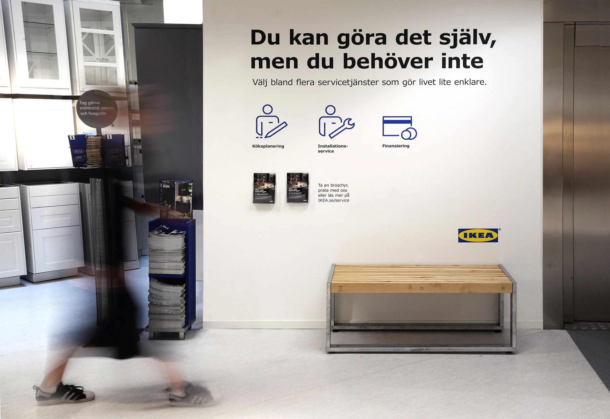
With constant expansion into new countries combined with an increase in communication channels, there is a clear need for a unified global language across all brand touchpoints. Above worked with IKEA on a scalable system of pictograms for the global market. Pictograms are a great element of the IKEA brand experience and visual expression.
Challenge
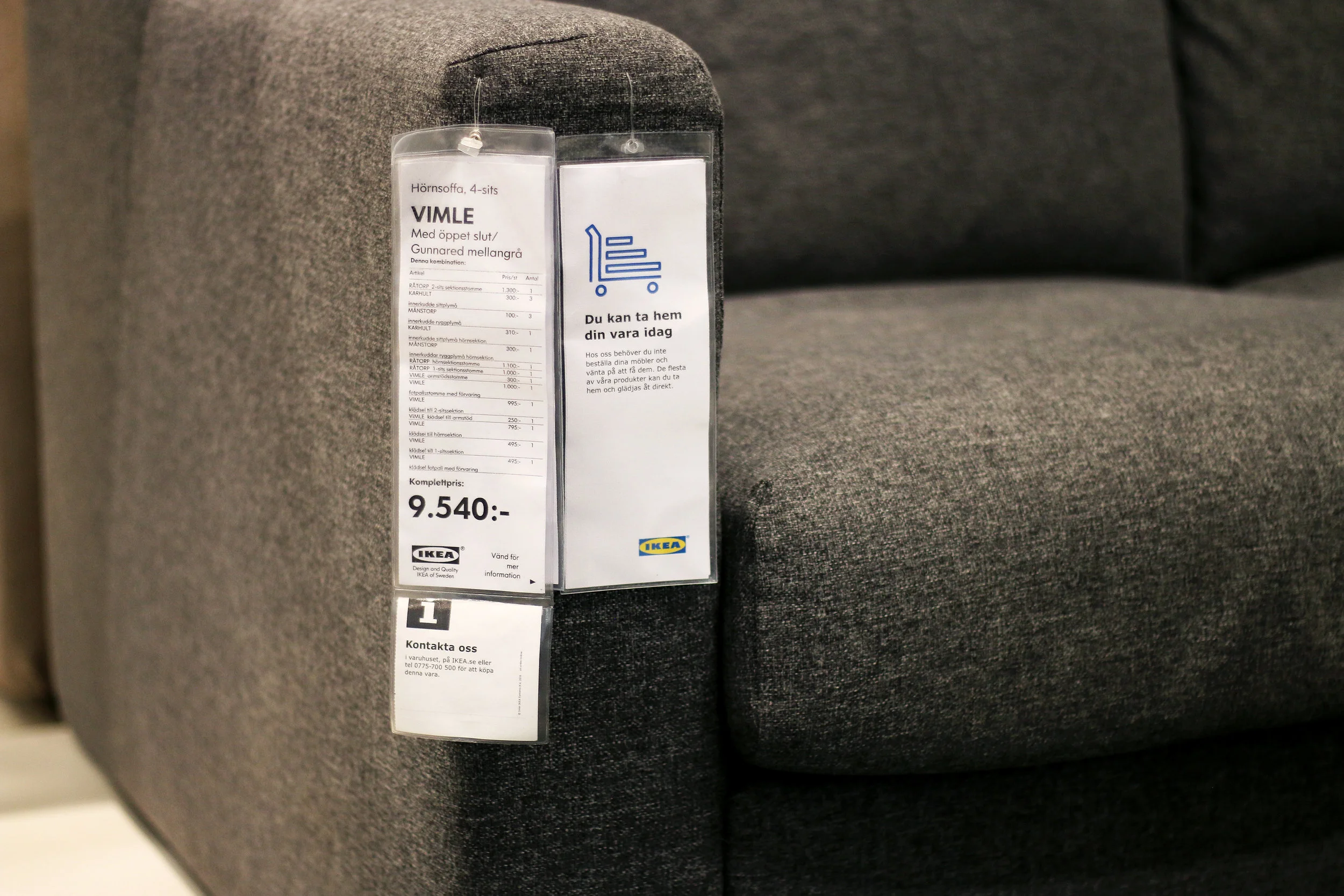
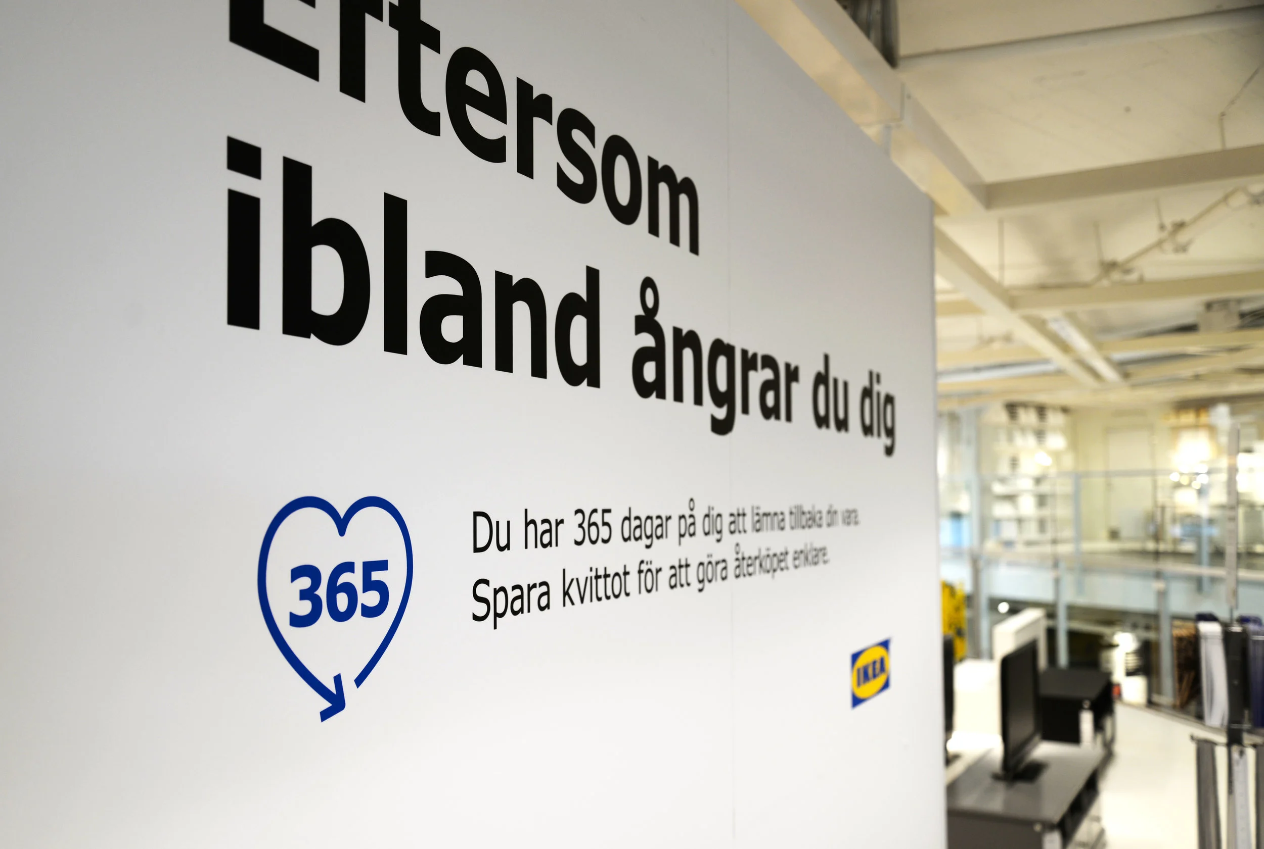
IKEA is continuously growing into new markets which entails an ever-increasing amount of services and communication channels. This presents the need for control, coherence and consistency - a unified global language - across all brand applications. Pictograms are one part of this unified language and are used in a wide variety of touchpoints.
Approach
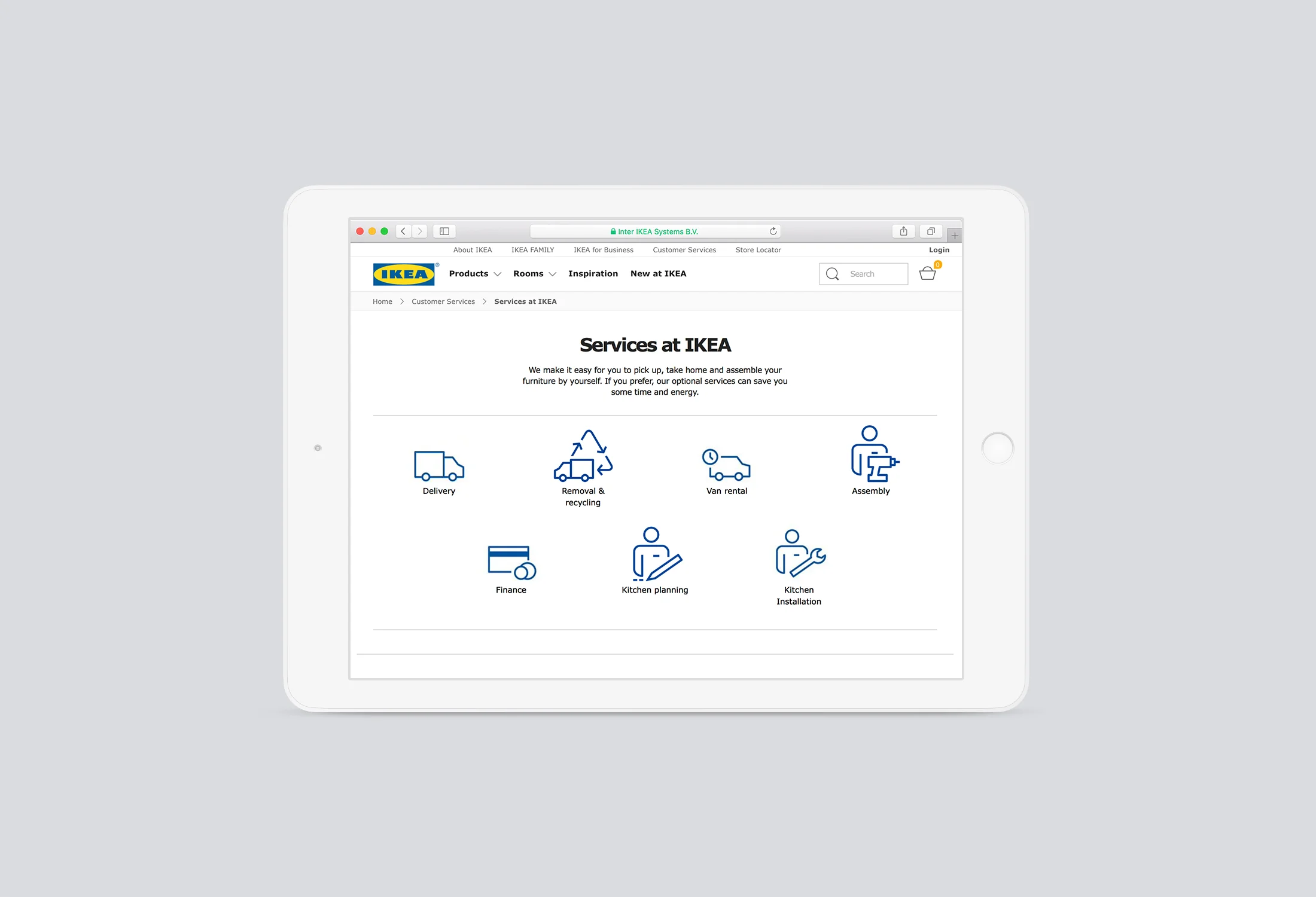
When approaching the task of creating a pictogram, we found it important to take the following points into account. The context it will be used in, is it in-store, online or both? Will it be accompanied by a service title or text communicating and supporting the action required? What is that text and does it simply translate to a visual? And, if there are other pictograms and communicative elements in the situation.
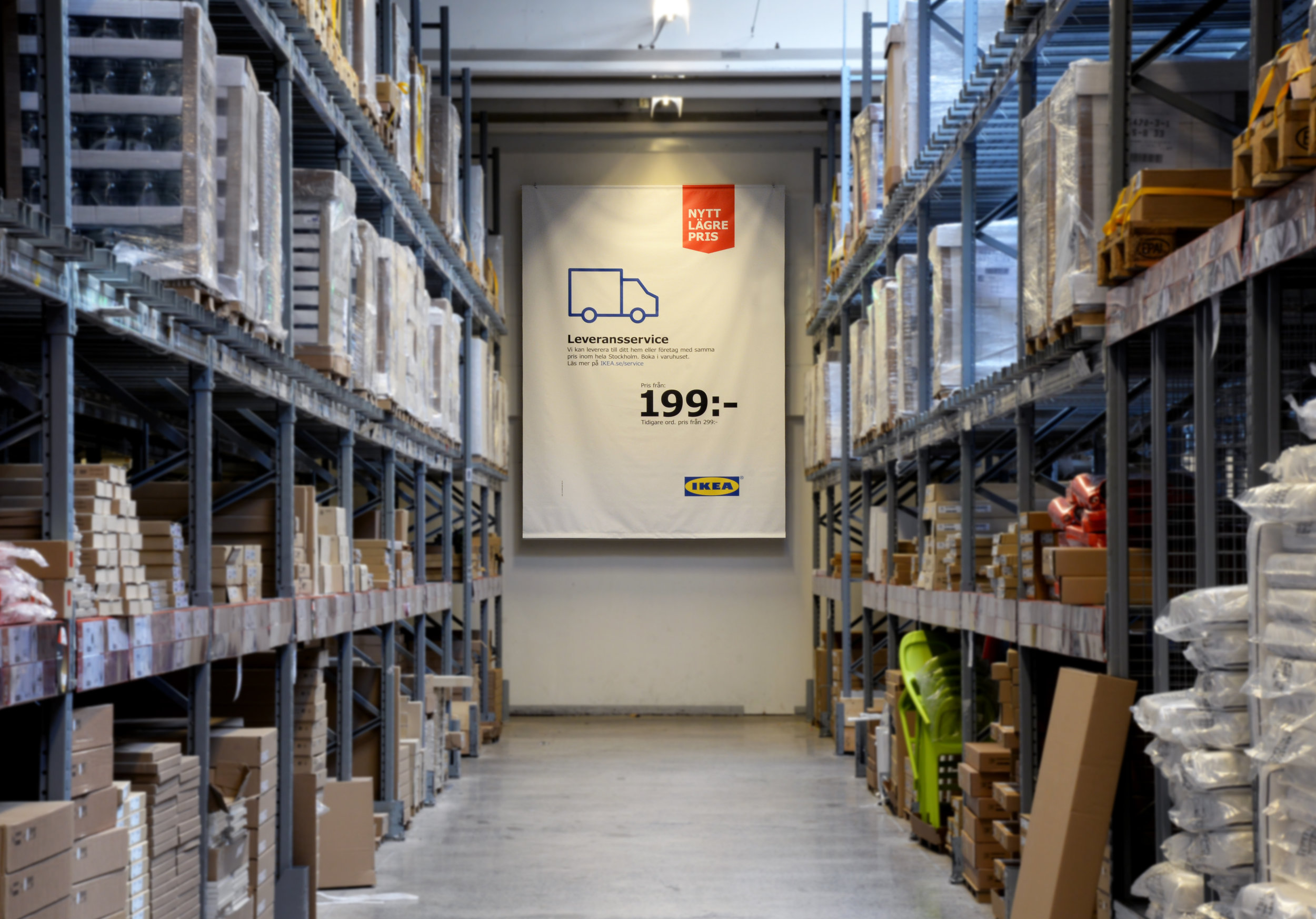
Result
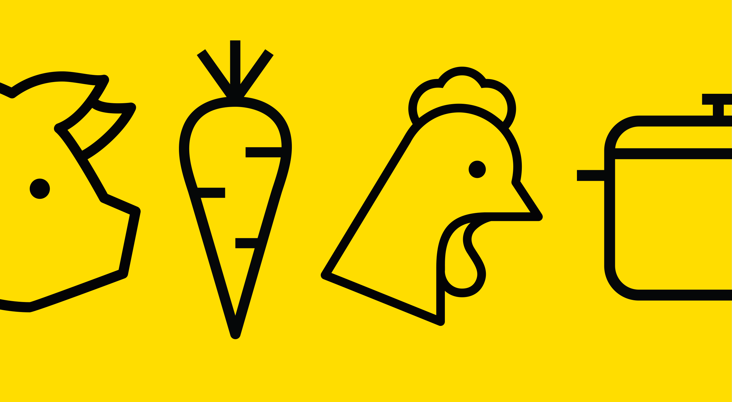
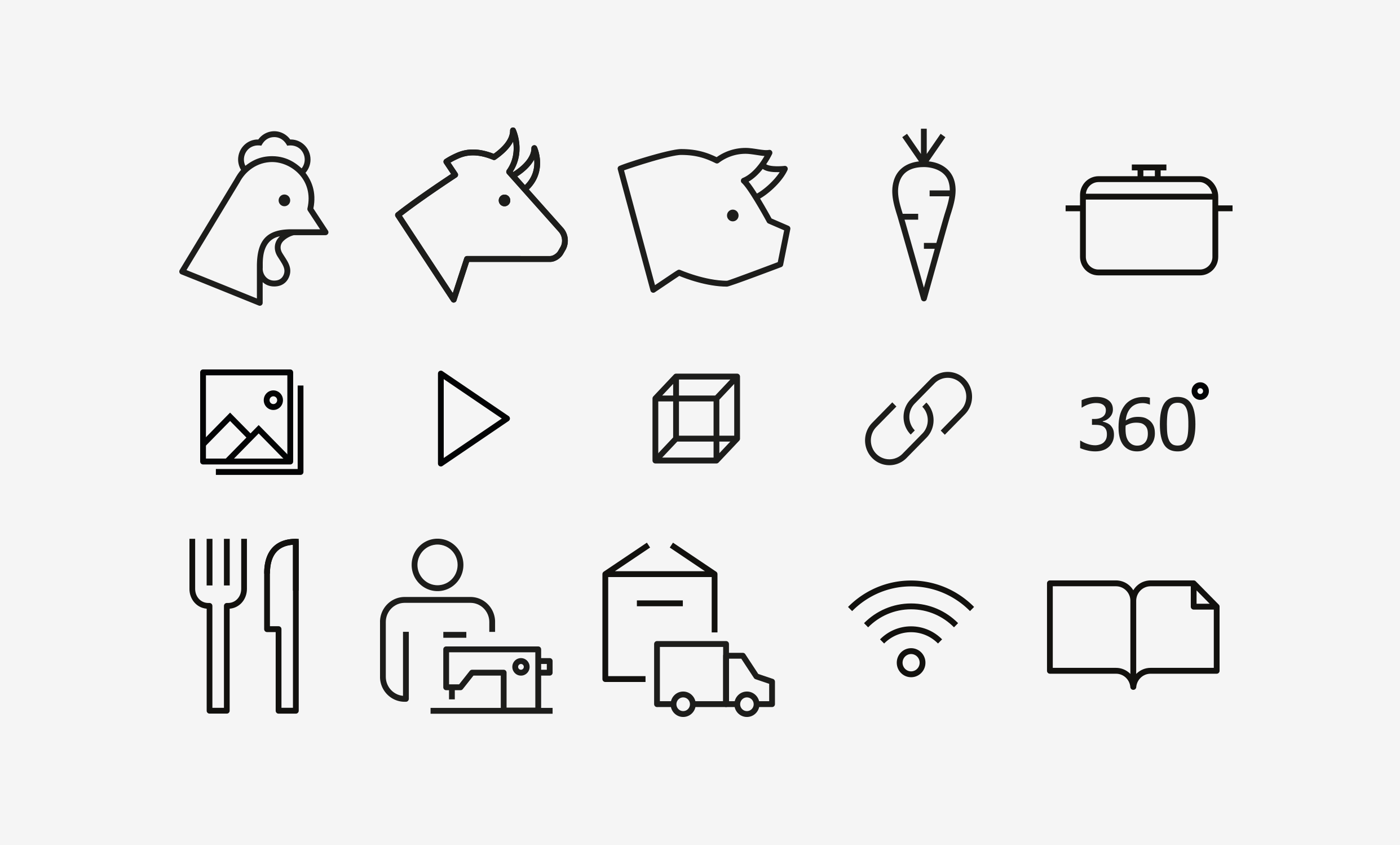
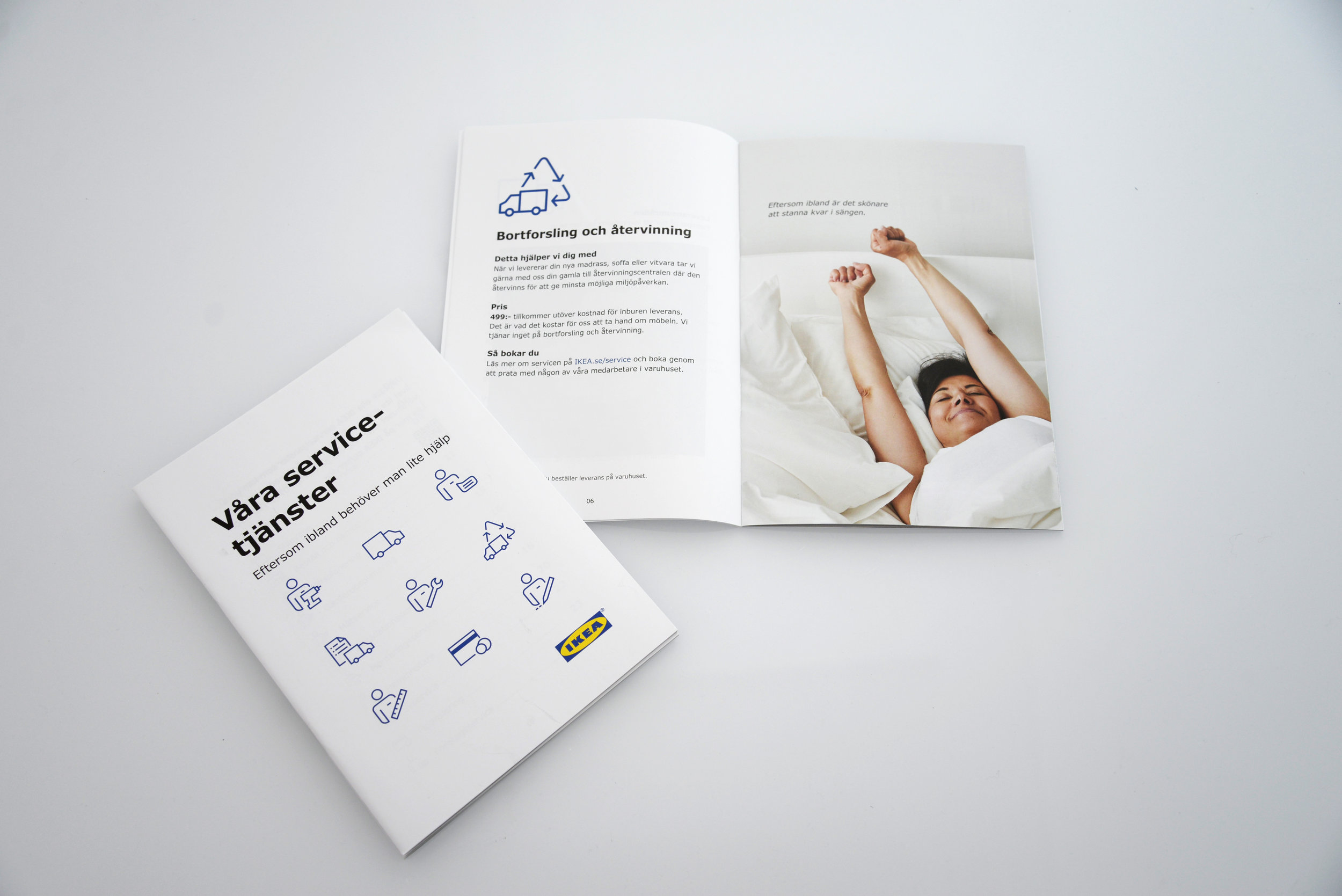
Our final delivery is a system that outlines the approach, methodology and visual guidance for designing and producing pictograms, in line with IKEA’s unified language, to be used by their staff and partners. To contextualize the system, we created a set of icons for the global IKEA market.
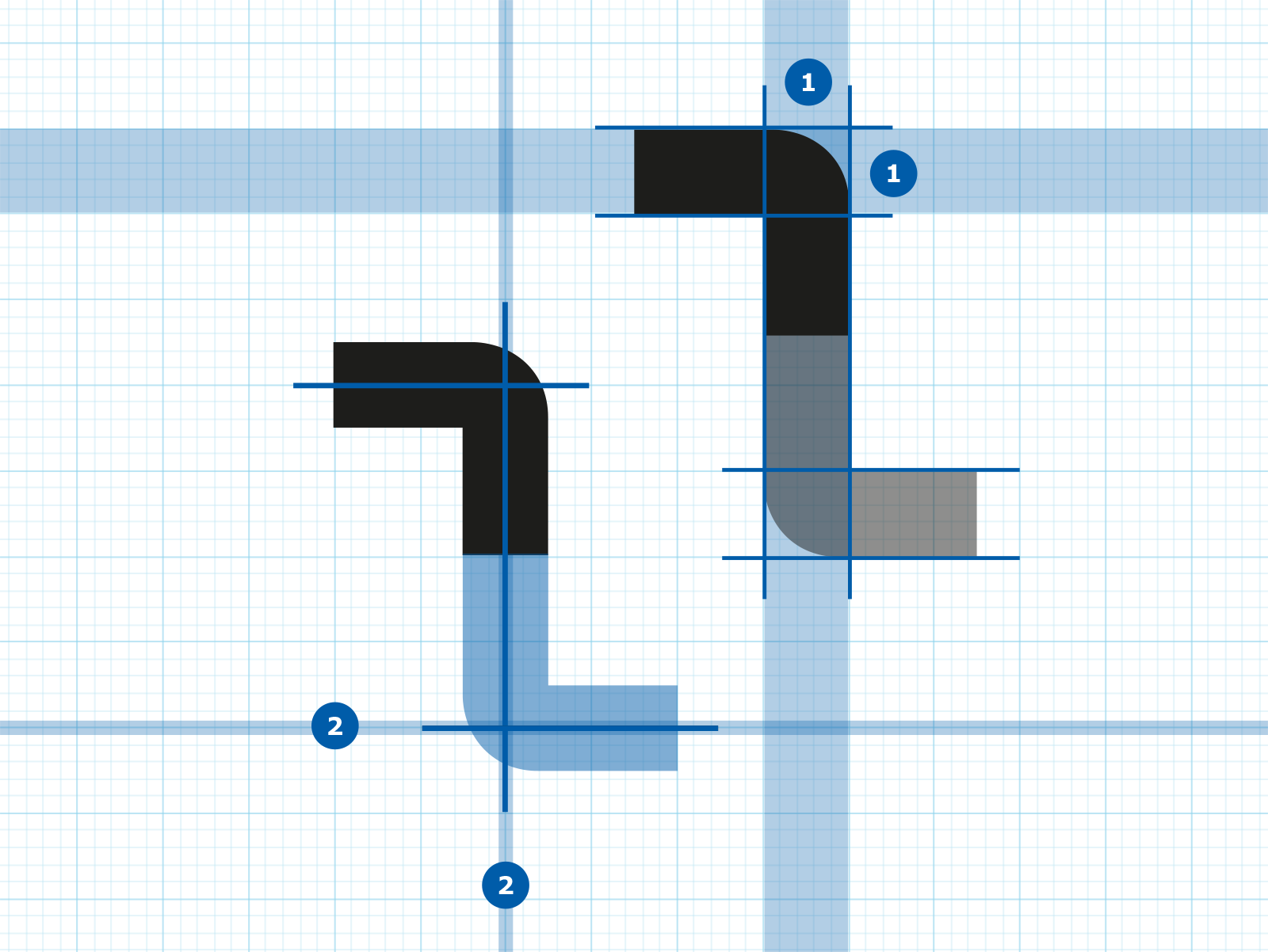
Hard & soft
The pictogram system is crafted to be friendly but at the same time informative and functional, aligning to IKEA fundamentals. It is achieved through the “hard & soft” approach of creating soft corners on the outside while retaining the sharp corners on the inside.
Iconified
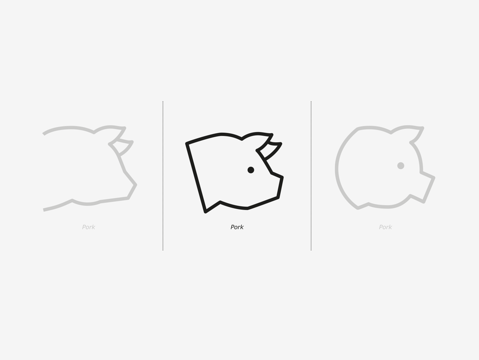
By iconifying the realism, we design pictograms and not illustrations. An example is that the pig’s leafy ears are kept, thus becoming a trademark signature needed for association and recognition.
Building blocks
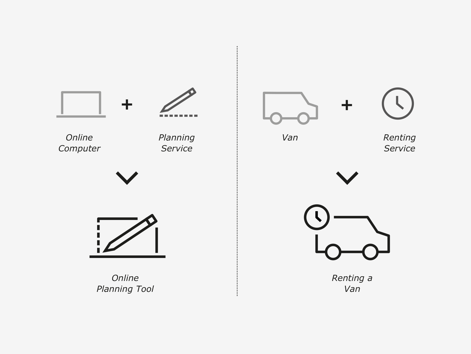
The system is designed in the way that designers and IKEA staff can create new pictograms in an easy an efficient way while still keeping the same visual style. Components can be separated, reused and recombined in order to create new compositions and pictograms that convey the correct message.
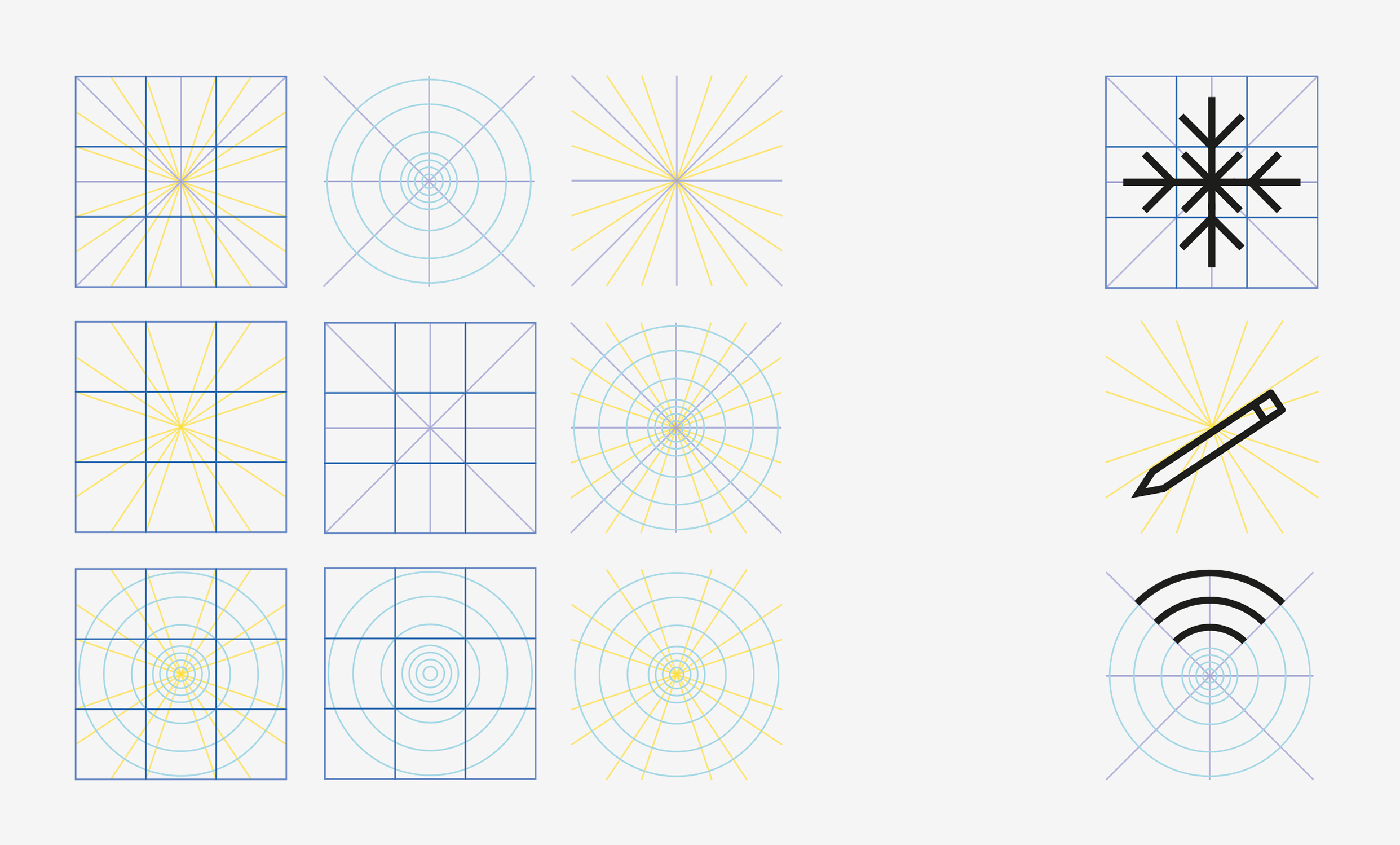
Grid
The grid serves as the base on which any designer can organize graphic elements when creating pictograms, and keep a consistent style. It has been crafted to be both flexible and rigid enough to create coherence and proportionality.
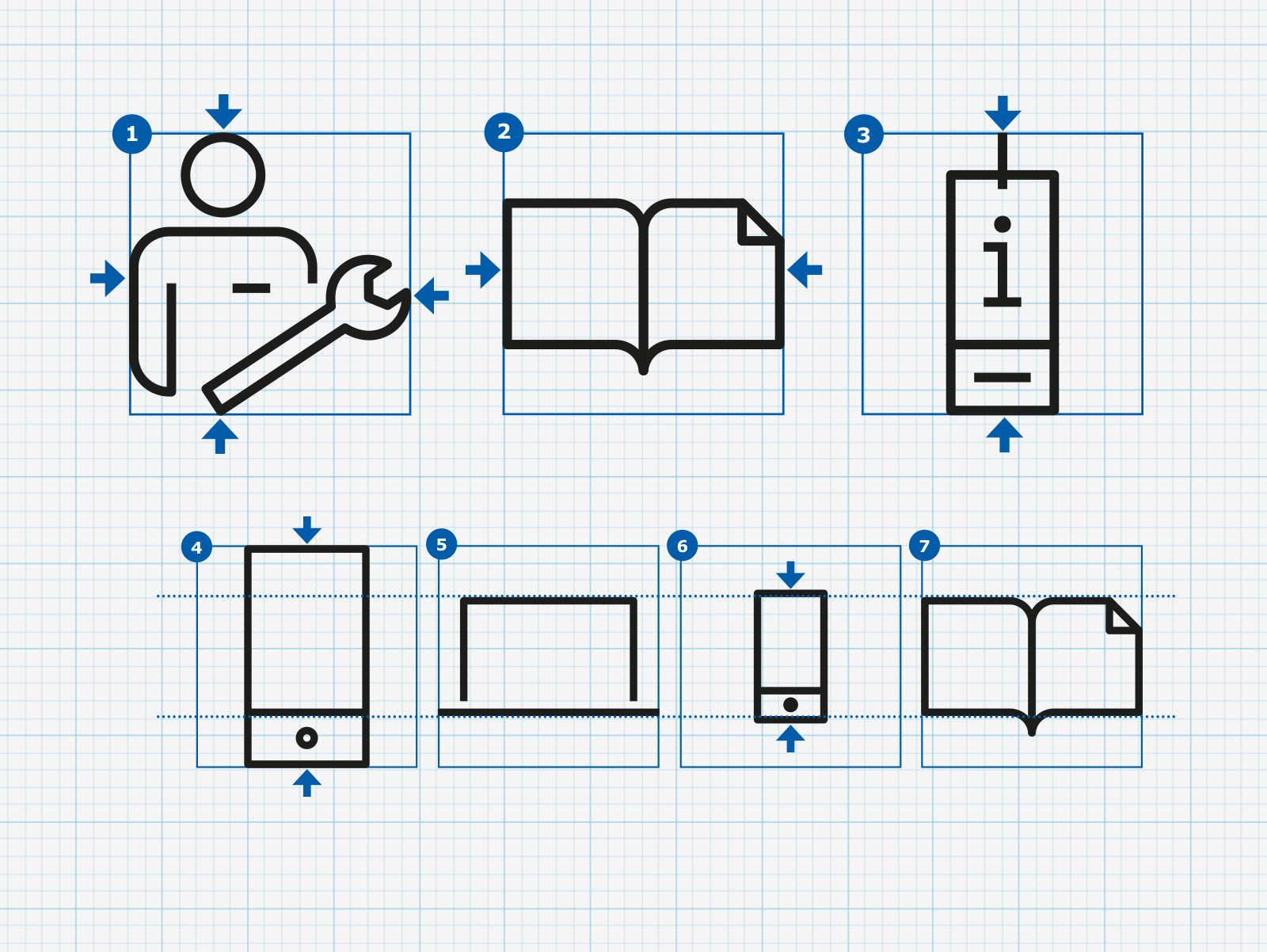
Size & proportions
A pictogram should strive to make use of the whole artboard, but not stretching it. Designers should always be mindful of the pictograms’ surroundings and their context. For example, if a large-sized smartphone is placed on the side of a normal-sized computer, the proportions will look and feel inappropriate.
Rules & settings
The artboard and stroke guide is the very core of the system - the style of the pictogram expression and output. The guide should be followed very closely as inconsistency is easily achieved when not followed in detail.
Capabilities
- Visual design
- Design Strategy
- Branding
- Design guidelines
About IKEA
At IKEA the vision is to create a better everyday life for the many people. The business idea supports this vision by offering a wide range of well-designed, functional home furnishing products at prices so low that as many people as possible will be able to afford them.